
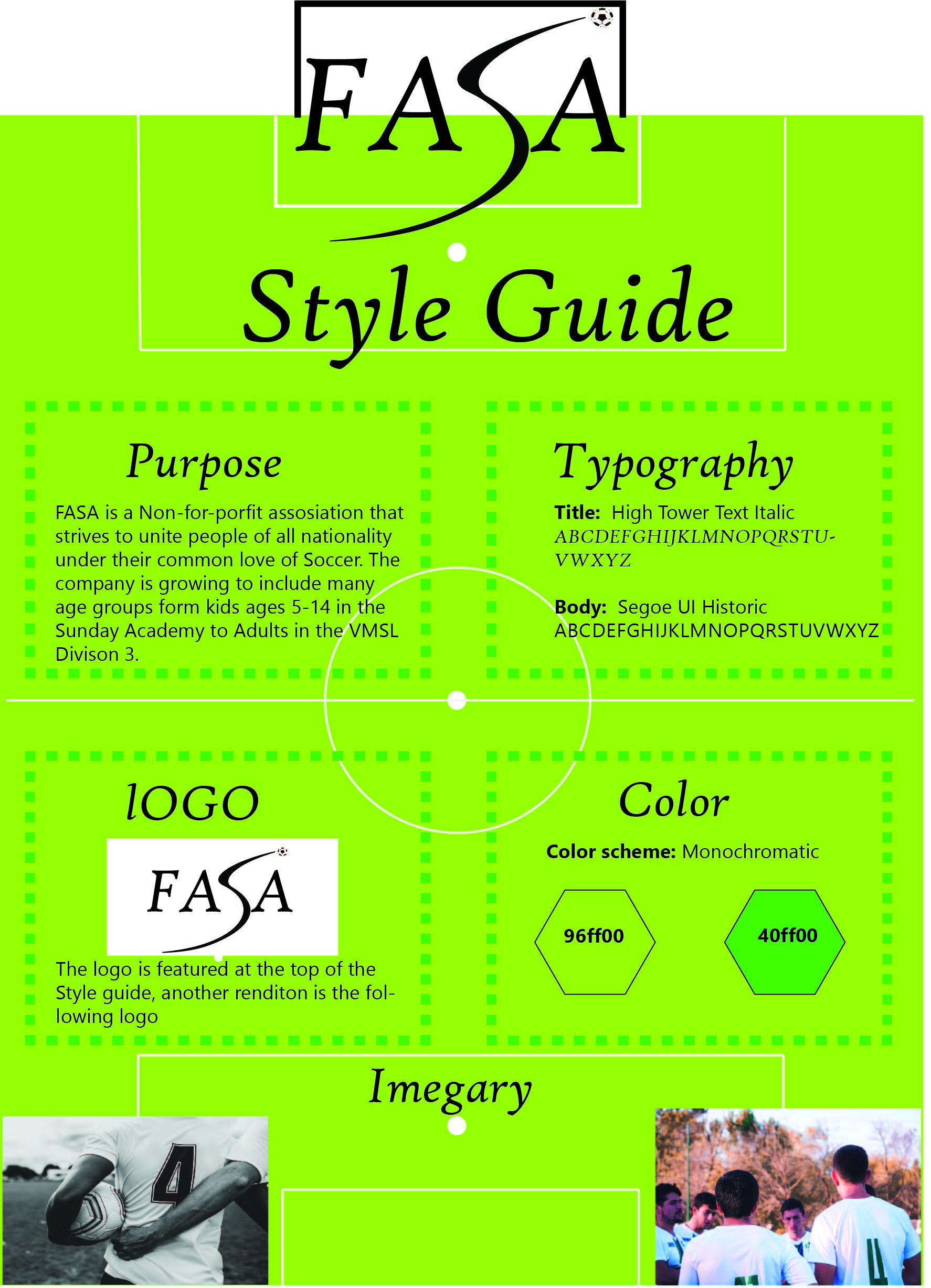
Overview
For this project I had to make a One-page Style Guide for a company of my choice. I had to recreate their logo, come up with a new color scheme, typography that works well together, as well as imagery that represented the company.
Process
I started out by brainstorming ideas for a new logo. Here is how the current logo looks:

Here are my sketches:
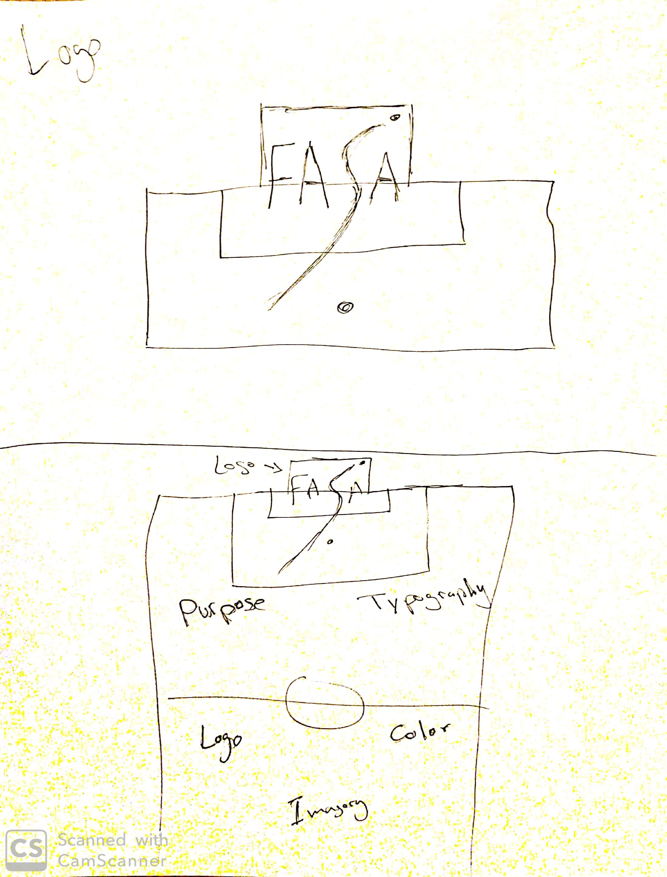
After finishing the sketches I went into Adobe Illustrator to try and design an appealing new logo. Here is what I came up with.
After the logo was done I tried to incorporate it in gestalt design where the style guide is a soccer pitch and the logo is on the top.
Critiques
My classmates gave me some really helpful feedback as I worked on my style guide. At first I was using a black dot as the the ball, Zantoza pointed out that it may be more appealing if it was a soccer ball. Manisha helped me with the typography as I struggled to find two typefaces that mesh well together. After I sent a couple of examples both my classmates helped me land on one that works well.

I really like the color you used. Green color is really support the football pitch. However, in middle right of your logo. It is better to used high-quality icon. The football icon’s pixel does not match the quality of the logo your designed. Furthermore, the layout style is very impressived. I like the pitch style. Finally, the pictures should be relative to the green color with the same style.
LikeLike
https://brandon649489302.wordpress.com/2019/07/02/7c-styleguide/
LikeLike