Overview
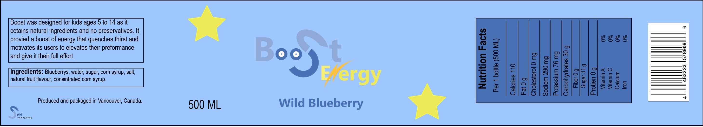
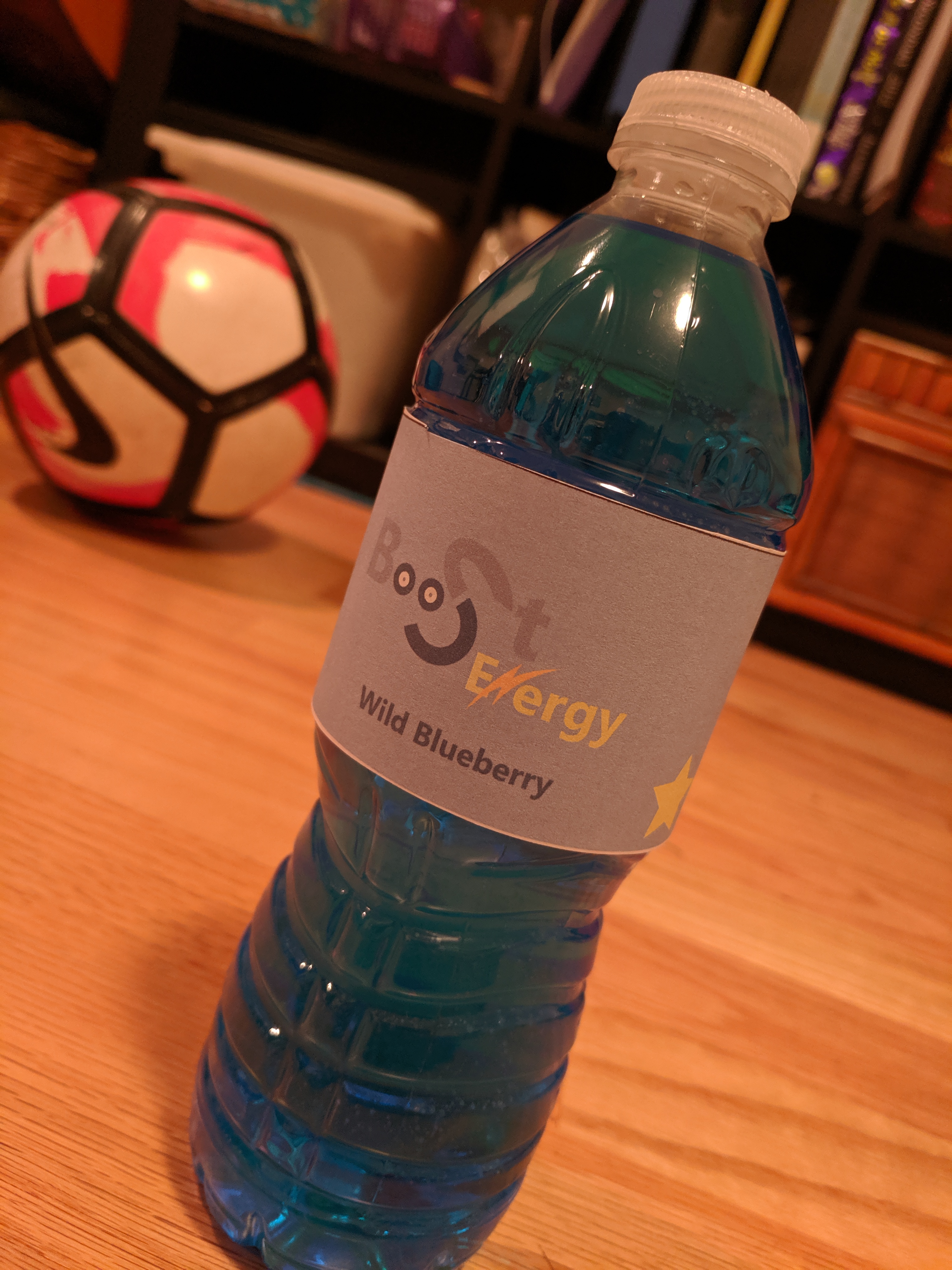
For this project I had to create a label for a product that one of my companies offers. In this case it was Soul Technical Facility. The product I choose was an energy drink for kids that was less harmful than the competition as it used natural flavour. I designed a new product logo, came up with a color scheme that suits the drink, as well as added some reoccurring design elements that gave it a “kid friendly” feel.
Process
I started by measuring the bottle that I was going to use, I went for a 500 ml bottle which proved challenging. Then I sketched out a 2 logo ideas and a layout of how the design would look.
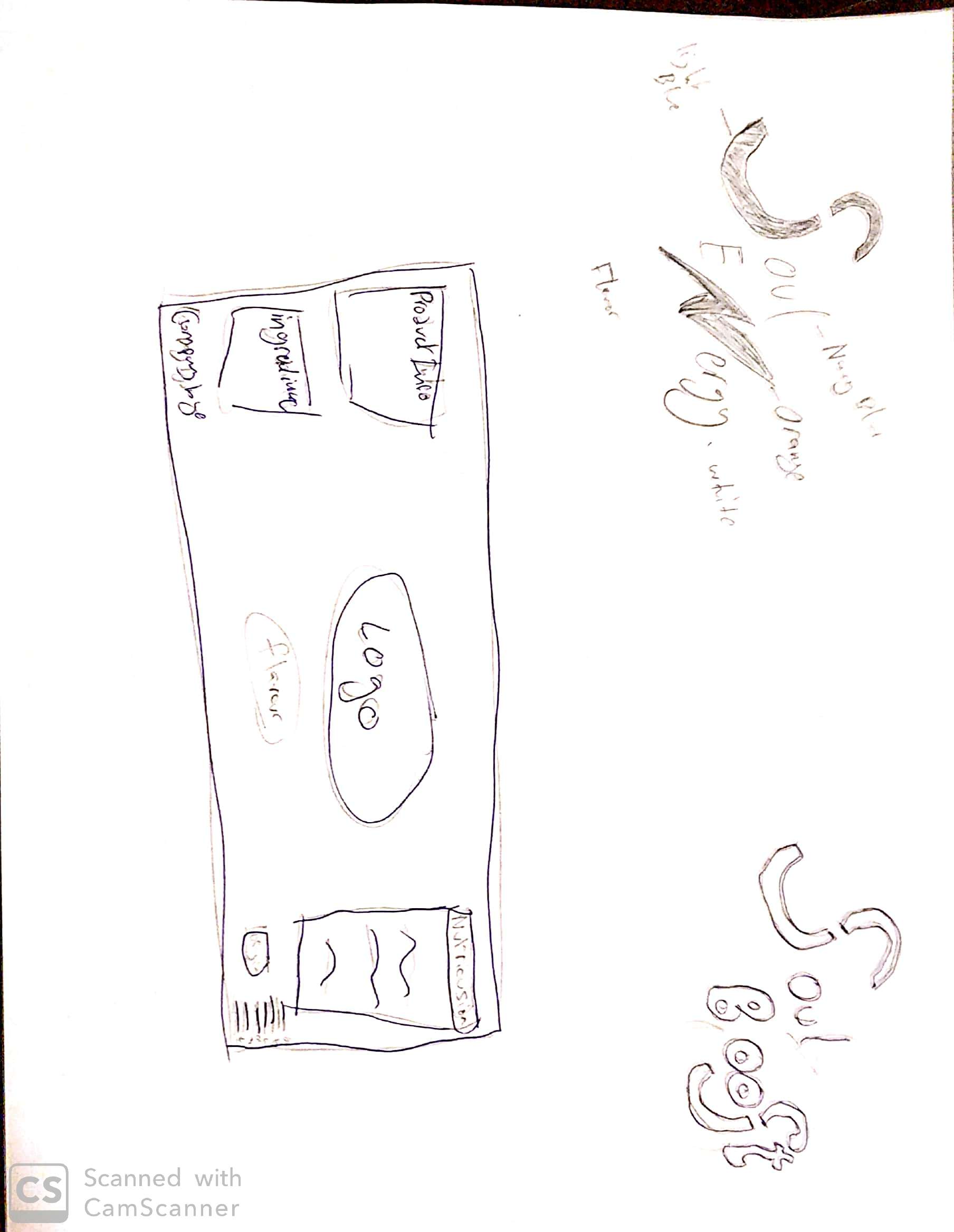
I ended up using a mix of the two logos and creating a new logo out of them called Boost Energy. I used Illustrator to design the label from scratch.
Critque
My group communicated through whatsApp. They gave me great advice even though it was late at night. Manisha recommended that I outline the stars with a darker shade to make them pop, and Mikal helped me with the color scheme.

Hi Riad,
Nicely done, I really like the creative logo you came up with for the bottle design. The attention to the kid friendly detailing to indicate its health consciousness is a smart approach.
Here’s a link to Benny’s site, which has a product with a vastly different target market from yours 🙂
https://bennychinvmm.wordpress.com/2019/07/08/9c-product-label-project/
Cheers,
Brandon
LikeLike