
Overview
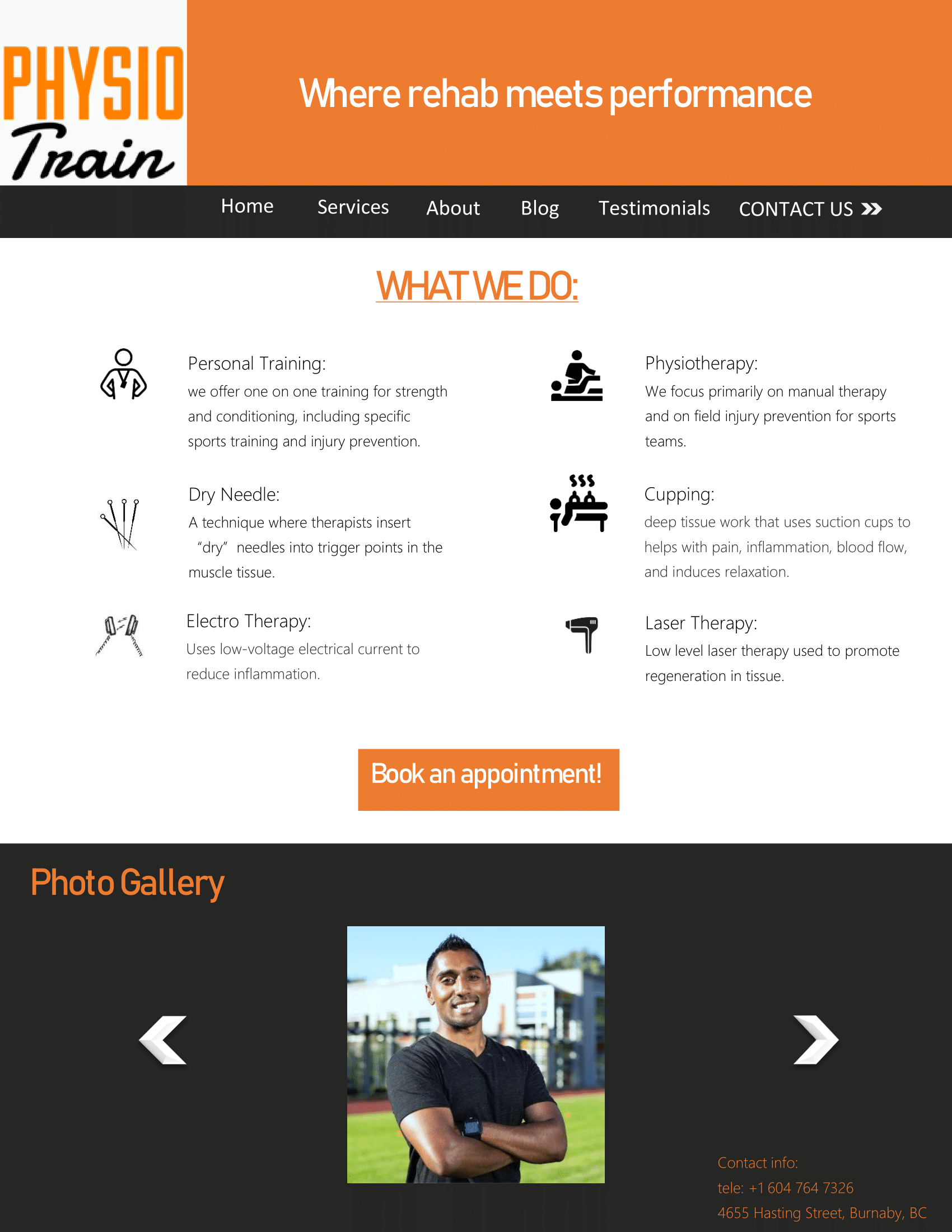
For this project I had to create a home page for my subsidiary company “Physio Train”. The home page on their current site is awkward with its sizing, and does not have a clear call to action. Here is how I redesigned it:
Process:
I first started it out by brainstorming ideas for my home page design. I took inspiration from their original page, however I tried to prioritize the services they offer. I sketched out what my layout would look like, then I made a shape map in Microsoft Word to guide me through the design.
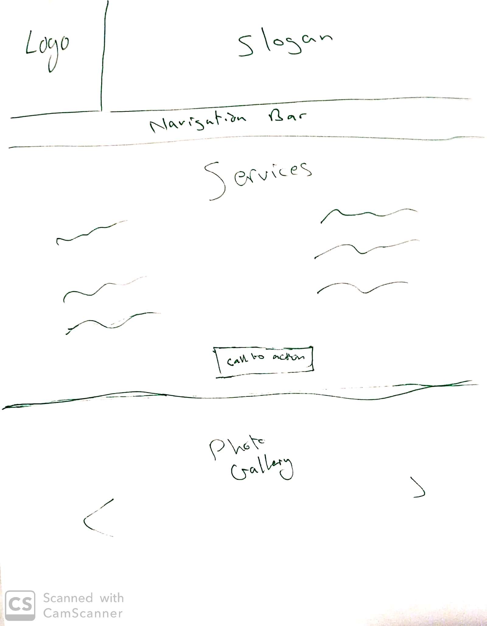
sketch 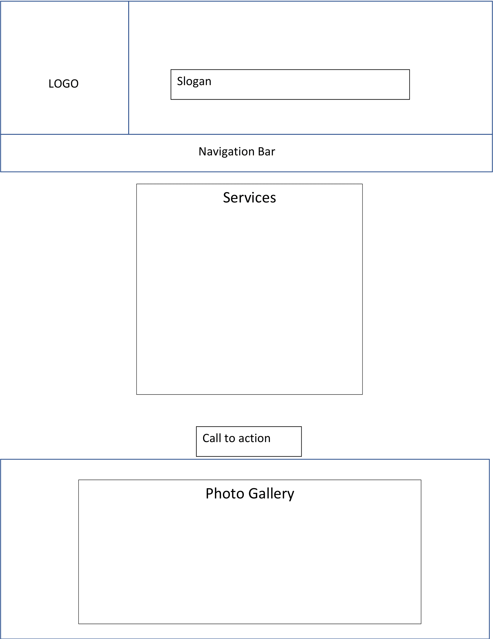
Shape map
After that I went back to Microsoft Word and completed the design for the home page. I used Orange, Black, and White as my three colors as they are the colors that make up the logo.
Critique
I got a lot of great feedback on this project, mostly because I completed earlier than usual. After I shared it on the WhatsApp group, Cameron pointed out that I didn’t include the address and phone number which are important aspects of a homepage, So I added them at the bottom in a way that would follow you as you scroll down or up. Surpreet pointed out that the “photo gallery” was too large at first, so I scaled it down. Mikal like the use of white space in the design as did many of my other group members, and Manisha suggested that I try and use a gradient for my final portfolio. All of this feedback helped me tweak the design to the way it looks right now.
Font used:
Title: Bahnschrift SemiCondensed; Body: Microsoft JhengHei UI Light.

I really like the color and layout you used. From the home page, it is easy to know what your company’s doing and easy to know what kind of training which are needed. However, you should have a footer. Well done overall!
Take look at Benny’s job, he did a great work.
https://bennychinvmm.wordpress.com/2019/07/22/11c-home-page-project/
LikeLike
Hi Riad, Nice layout of your homepage! Great use of the colour scheme as well, very consistent with the white, black and orange through out the page. Nice choice in icons and very clear call to action buttons! Great job overall!
I also did a home page layout, check it out! https://zvsavellano.wordpress.com/2019/07/23/11c-home-page/
LikeLike
Hey Riad,
Nicely done on this! It looks nice and clean with a clear message and sharp design. I think the consistent branding ties things together very well, and the logos really help to visually explain the company.
Check out mine if you’re interested!
https://brandon649489302.wordpress.com/2019/07/23/11c-homepage-stadia-premium/
Cheers,
Brandon
LikeLike